For much of the first half of the twentieth century, a movie poster was more than an ad with a star's photograph and a title. It was an artist's interpretation of a movie. Painters and illustrators took the romance, danger, comedy, adventure, or mystery of a film and turned it into one strong image that could stop people on the street and make them want to buy a ticket.
In the United States, Hollywood studios had large advertising departments and regularly hired illustrators to create poster campaigns. Film historian Stephen Rebello, in Reel Art: Great Posters from the Golden Age of the Silver Screen, describes the years from roughly 1910 through 1950 as a golden age of movie-poster illustration. Artists painted stars, dramatic scenes, romantic couples, monsters, cowboys, detectives, and comedians in ways that were meant to capture the feeling of the movie rather than simply copy a still photograph.
Europe often took that freedom even further. French, German, Italian, Polish, Scandinavian, and other artists could interpret the same American movie in completely different ways. A Hollywood poster might emphasize the stars. A French version could turn the same film into a romantic painting. A Polish artist might reduce it to a strange symbol. A German artist might make it bold and graphic. In many cases, the foreign poster barely resembled the American one, even though both advertised exactly the same movie.
France: Personality, Color, and Brushwork
French movie posters are especially useful for seeing how much individual style mattered. Clément Hurel often used only a few characters, placing them strongly in the foreground instead of filling every inch of the poster. His people were not always realistic. They could be playful, exaggerated, sensual, or humorous. His female figures sometimes reflected the pin-up style of the 1950s, and his light colors could make the finished poster feel almost like a watercolor or quick pencil sketch.
George Kerfyser worked very differently. His backgrounds were often simple fields of blue, green, gray, or red. Against them he placed strongly outlined figures that could be realistic in one poster and almost cartoon-like in another. The simplicity gives many of his posters a surprisingly modern look. Some could easily be mistaken for graphic-novel covers designed decades later.
René Péron
Péron loved bright colors, sharp contrasts, and powerful lettering. Reds, oranges, pinks, yellows, and blues often crash together in energetic compositions. Faces remain recognizable, but the poster as a whole feels designed and painted rather than copied from a photograph.
Roger Soubie
Soubie brought a softer, more painterly look to movie advertising. He paid close attention to light, shadow, skin, fabric, and atmosphere. His stars often look lifelike, but he arranged them freely within elaborate compositions that clearly show the hand of an illustrator.
Film-poster specialist Adrian Curry has written about other French artists who worked in the same tradition. Roger Jacquier, known as Rojac, created colorful, uncluttered posters during the 1940s and 1950s. Constantin Belinsky could make even a modest B-movie look spectacular through color and dramatic illustration. Christian Broutin began creating movie posters in 1954, during a period when an illustrator could still develop a personal visual idea for a film instead of simply arranging approved photographs.
Germany: Strength and Drama
Klaus Dill is a good example of the power found in German movie-poster illustration. His background in Western comic art gave his posters a strong sense of action. Faces could be carefully shaded and realistic, but the bodies were especially impressive. Dill gave his figures weight and volume, almost as if he were sculpting them with paint. Cowboys, adventurers, and action stars became larger than life.
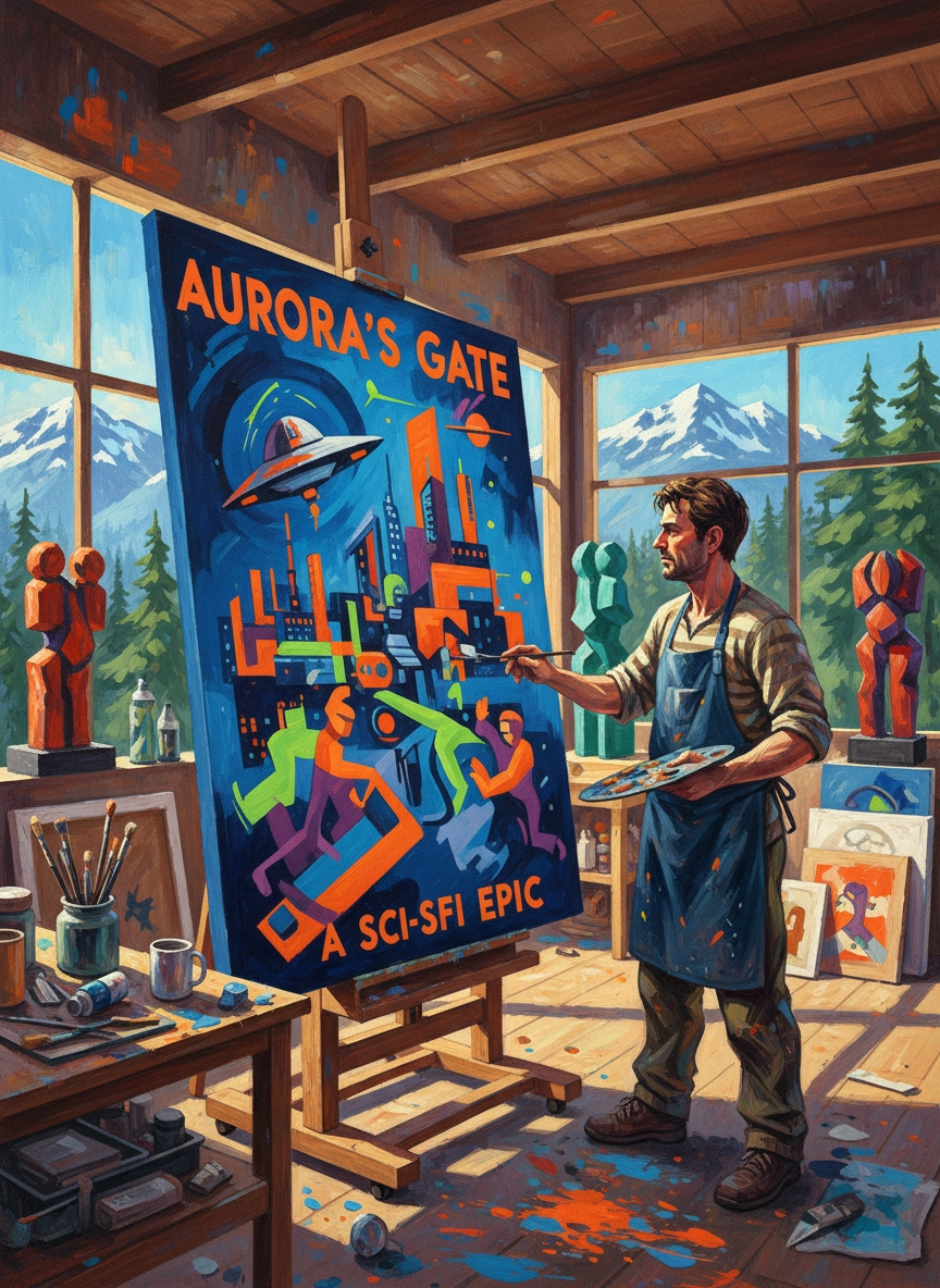
This was one of the great advantages of painted movie advertising. A photograph shows what was in front of the camera. A painter could show what the movie felt like. He could make an actor tougher, a villain more threatening, a romance more passionate, or a landscape more spectacular than anything captured in a publicity still.
Italy and Scandinavia: Films Reimagined
Italian movie posters became famous for dramatic painting, large star portraits, romantic scenes, and rich color. Even when the actor's likeness was accurate, the rest of the image might be completely invented. Landscapes could become grander, gestures more emotional, and lighting more theatrical. The poster did not have to look exactly like one frame of the movie. Its job was to create excitement.
Scandinavian movie posters also show how far artists could move away from literal realism. Some relied on simplified shapes, unusual colors, strong blocks of lettering, or stylized figures. A poster could suggest an idea rather than explain the plot. This kind of freedom made foreign versions of American films especially interesting: audiences in different countries might see completely different artistic interpretations of the same title.
What Changed?
Photography itself did not ruin movie posters. Some excellent poster designers mixed photographs with painting, collage, drawing, or unusual typography. The real change came when photography became the standard starting point instead of just one possible tool.
By the later twentieth century, movie advertising increasingly relied on publicity photographs. A studio could place the biggest star's face at the top, supporting actors beneath it, add an explosion or landscape in the background, and place the title across the bottom. Computer design made this process faster and easier. It also made it easier for studios to control exactly how every actor appeared.
Drew Struzan, one of the best-known modern movie-poster illustrators, has spoken about this change. His painted posters for films such as Star Wars, Indiana Jones, and Back to the Future continued the older tradition well into the late twentieth century. But he has said that by the 1990s computer-based advertising had become dominant and illustrated posters were becoming much less common.
Movie-poster artist Steve Chorney has made a similar point. When he created the painted poster for Quentin Tarantino's Once Upon a Time in Hollywood, it deliberately recalled the illustrated advertising of the 1960s and 1970s. The fact that the poster looked unusual was part of the point: traditional painted movie advertising had become rare enough to feel special again.
Why the Old Posters Still Matter
What was lost was not simply paint and brushes. It was the extra imagination of another artist. A director made the movie, but the poster artist interpreted it for the public. Hurel could make a film playful. Péron could turn it into an explosion of color. Soubie could make it romantic and elegant. Dill could make it powerful and heroic. Other European artists could make the same movie mysterious, surreal, humorous, or almost abstract.
That is why vintage movie posters are so interesting today. They are pieces of movie history, but they are also evidence of a time when the advertisement itself could be an original work of visual imagination. Two artists could advertise the same film and produce two completely different pictures, each revealing something about the artist, the country, and the era in which it was made.
Modern movie posters can still be beautiful, and photography can certainly be used creatively. But when studios rely on the same combination of star photographs, digital backgrounds, and standard layouts, something is missing. The old system gave painters and illustrators room to surprise the audience before the movie even began.
For collectors today, that may be the greatest appeal of vintage poster art. These posters do more than remind us of old films. They preserve an era when the first image audiences saw of a movie was often not a photograph at all, but a painting.
Sources & Further Reading
- Stephen Rebello and Richard C. Allen, Reel Art: Great Posters from the Golden Age of the Silver Screen (1988), a history of classic Hollywood movie-poster creation and illustration.
- David Konow, “The Art of the Poster,” MovieMaker Magazine, including Drew Struzan’s comments on the decline of illustrated movie posters.
- Adrian Curry, movie-poster histories and artist profiles for Film Comment and MUBI Notebook, including Roger Jacquier, Constantin Belinsky, Christian Broutin, Wojciech Fangor, Jan Lenica, and Michel Landi.
- Leslie Combemale, Motion Picture Association interview with Steve Chorney on creating the illustrated Once Upon a Time in Hollywood poster.